
Warning: this is going to make you want to go update all your colors
OKLCH is a new color model available in CSS.
- It supports wide-gamut P3 colors, giving designers access to more beautiful, vibrant colors than they do with hex/RGB colors (e.g.
#0059da)1.- Every hex/RGB color can also be represented exactly in OKLCH, but the reverse is not true.
- It is better for color modifications than HSL because it uses
perceived lightness - The more predictable nature of perceived lightness means that OKLCH is more accessible than other color models. If text is visible on one hue, it is visible on every hue.
- It is tailored to how our eyes see colors rather than color math.
- It is more human-readable than RGB or hex.
All this together means that OKLCH is the superior choice for design systems because it frees designers from the need to manually choose and tweak every color. Instead you can choose a few colors and define a formula that automatically generates the rest of the color palette (more on that later).
Definitions
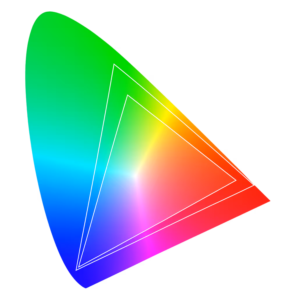
Section titled: DefinitionsColor Gamut
Section titled: Color GamutGamut defines a subset of the colors that the human eye can perceive.
Common gamuts include sRGB, the web default; and Display P3 (developed by Apple), which is used on modern displays.
Color Model
Section titled: Color ModelTo describe colors in software, conventions for describing colors with numerical values are needed. That convention is a color model. It’s a numerical way to describe colors using a set of components.
However a color model does not define exact colors or a color gamut. It’s abstract and device-agnostic. Think of it as the coordinate system (e.g. x,y, NESW), not the map.
Some examples of color models are RGB, HSL, CMYK, OKLab, and OKLCH.
Color Space
Section titled: Color SpaceTo create a color space you:
- pick some colors
- arrange them, however you like, into some kind of space (usually 3D)
- define coordinates (a color model) for navigating around that space
But your color space isn’t useful to anyone, so let’s leave that to the pros, OK?
Think of a color space as the map that specifies which colors a set of numbers represent in the real world. It is a specific, fully-defined realization of a color model. Eric Portis describes this better than I can in Okay, Color Spaces and is definitely worth a read if you want to really understand color spaces.
Some examples of color spaces are; sRGB, Adobe RGB, P3, Rec2020, OKLab, and OKLCH.
CSS Syntax
Section titled: CSS SyntaxIn oklch(l c h) or oklch(l c h / a):
lis perceived lightness (0-1), the brightness of the color. “Perceived” means that it has consistent lightness to the human eye across any hue, unlike the L inhsl().cis chroma (0 to ~0.43), the intensity of the color, similar to saturation.his hue (0-360), measured in degrees around the color circle.ais alpha (0-1 or 0-100%), the transparency of the color
button { background: oklch(0.45 0.26 264); /* blue */ background: oklch(1 0 0); /* white */ background: oklch(0 0 0 / 50%); /* black with 50% opacity */}How to make a color palette with OKLCH
Section titled: How to make a color palette with OKLCHTo create a color palette, designers usually have to hand-pick 50+ colors; individually ensuring that they all feel cohesive and that red-500 isn’t way darker than blue-500.
With OKLCH, you can rapidly create an entire palette by making only a few decisions and letting the guarantees of the color model help with the rest.
- Start with your company brand color and change only the hue to get your other initial core colors
- oklch(0.5 0.25 260)BRAND blue
- oklch(0.5 0.25 300)core purple
- oklch(0.5 0.25 280)core blurple
- oklch(0.5 0.25 9)core red
- oklch(0.5 0.25 228)core cyan
-
Optional: Adjust the chroma (don’t change the lightness) to push those initial core colors into the P3 range for extra pop!
-
Change only the lightness to get the shades
- oklch(0.850 0.25 260)blue 50
- oklch(0.780 0.25 260)blue 100
- oklch(0.730 0.25 260)blue 200
- oklch(0.690 0.25 260)blue 300
- oklch(0.660 0.25 260)blue 400
- oklch(0.625 0.25 260)blue 500
- oklch(0.590 0.25 260)blue 600
- oklch(0.550 0.25 260)blue 700
- oklch(0.5 0.25 260)BRAND blue 800
- Now just take that exact same set of lightness values, apply them to the other core colors, and you’re DONE!
- oklch(0.850 0.25 300)purple 50
- oklch(0.780 0.25 300)purple 100
- oklch(0.730 0.25 300)purple 200
- oklch(0.690 0.25 300)purple 300
- oklch(0.660 0.25 300)purple 400
- oklch(0.625 0.25 300)purple 500
- oklch(0.590 0.25 300)purple 600
- oklch(0.550 0.25 300)purple 700
- oklch(0.5 0.25 300)core purple 800
Perceived Lightness
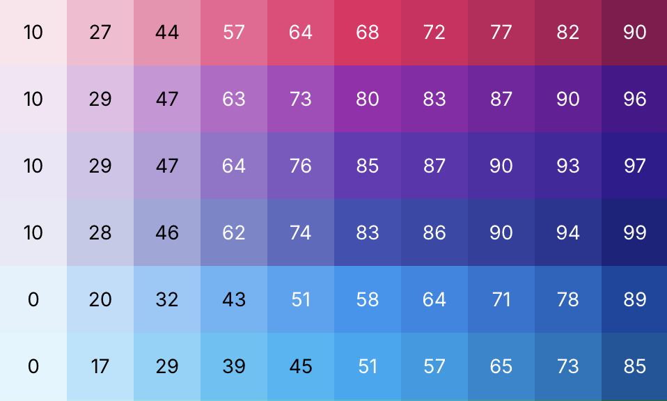
Section titled: Perceived LightnessYou can use the same technique to create color palettes with color models like HSL, but look what happens once you try to add text:
All these colors have the same lightness value (0.5 / 40%), but with the HSL colors, the text is harder to read on some buttons than others. But for the OKLCH colors, the text is equally easy to read on any of the buttons.
This is how HSL colors lead to accessibility issues; across the same lightness value, some hues look lighter, some darker. The “perceived” lightness is different even though the mathematical lightness is identical.
This is one of the major advantages of OKLCH over other color models. Creating perceptually uniform color palettes and working with them is quite easy.
HSL’s Big Lie
Section titled: HSL’s Big LieThe main problem with HSL is that it has deformed the sRBG color space to allow every hue to be paired with every saturation value. But that is a lie.
In reality, our eyes (and our displays) have different max saturations for different hues. HSL hides this complexity by deforming the color space; it stretches the available saturation values for every hue to go from 0-100.
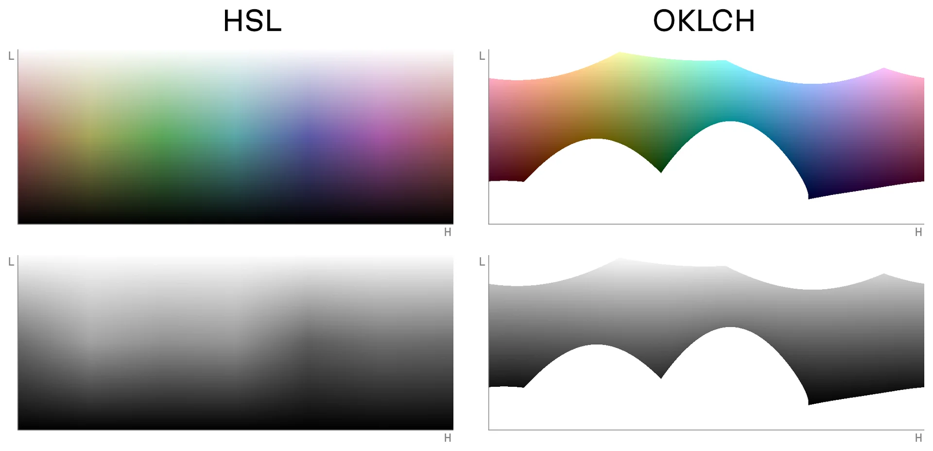
HSL’s color space deformation is why its lightness value does not match up with what our eyes perceive. HSL’s perceived brightness is not consistent across the hue axis (look at the stark black and white “bars” as you go across the HSL hue axis).
Gradients
Section titled: GradientsOKLCH vs HSL Gradients
Section titled: OKLCH vs HSL GradientsThese gradients that all have constant lightness and chroma for every color.
Uneven & Inconsistent
Section titled: Uneven & InconsistentAs you can see, the HSL gradient is quite uneven and there are clear differences in lightness across the different hues. Yellow, magenta, and cyan appear much lighter than red and blue.
Hue Shift
Section titled: Hue ShiftLooking at a simple white-to-blue gradient, you can see how HSL hue shifts towards purple in the middle.
Caution: Gradients work differently in OKLCH
Section titled: Caution: Gradients work differently in OKLCHIn rectangular color spaces, gradients are calculated by interpolating the red, green, and blue values from the start color into the end color. Because OKLCH has a cylindrical color space (uses polar coordinates), its gradients work differently; OKLCH gradients rotate around the hue axis to get from the start color to the end color.
The result of this is an unexpectedly beautiful gradient, but one that includes several hues that you did not specify.
The OKLCH gradient looks nicer because it avoids the “gray dead zone” (HSL also does this because it also has a cylindrical color space, but goes the opposite way around the color wheel).
But it’s safe to say this isn’t what most people expect, so gradient generation tools will typically use a rectangular color space like OKLab.
Native color manipulation in CSS
Section titled: Native color manipulation in CSSCSS Color 5 is now available in 89% of browsers and finally gives us the ability to manipulate colors directly in CSS!
The syntax is a bit unusual; l, c, and h are implicit variables that represent the lightness, chroma, and hue from the original color:
:root {  --brand: oklch(0.5 0.25 260);
  /* 20% lighter version -- oklch(0.7 0.25 260) */  --brand-accent: oklch(from var(--brand) calc(l + 0.2) c h);
  /* Red version of brand color -- oklch(0.5 0.25 0) */  --error: oklch(from var(--brand) l c 0);}
Tools for working with OKLCH
Section titled: Tools for working with OKLCH- OKLCH color picker: https://oklch.com
- OKLCH bulk converter: https://oklch.fyi/bulk-convert
- OKLCH color palette generator: https://huetone.ardov.me
- OKLCH Figma plugin
Attribution
Section titled: AttributionI pulled heavily from several other articles in order to write this one:
- Evil Martians: OKLCH in CSS: why we moved from RGB and HSL by Irina Nazarova
- What are OKLCH colors? by Jakub Krehel
- A perceptual color space for image processing by Björn Ottosson, the creator of OKLab and OKLCH
- How software gets color wrong by Björn Ottosson, the creator of OKLab and OKLCH
- Okay, Color Spaces by Eric Portis
These were also helpful:
- Make Beautiful Gradients by Josh W Comeau
- ColorAide 3D color space visualizations created by Isaac Muse
- Sass color spaces & wide gamut colors by Miriam Suzanne
Footnotes
Section titled: Footnotes-
OKLCH is defined in such a way that it even supports colors beyond P3; that monitors can’t display yet. ↩
-
The OKLab and OKLCH color spaces are two names for the same space. The difference between them is that OKLab uses rectangular coordinates to navigate around the space and OKLCH uses polar coordinates. ↩
-
Technically chroma goes up to infinity to support future colors, but CSS currently treats 0.4 as 100% ↩